 |
 |
 |
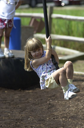
| Original image | With NASA technology | With Photoshop |
In a recent press release, NASA demonstrated their "retinex" image enhancement technology. It seems to do a good job of pulling out detail from all brightness levels within a picture, something that is difficult to do with the usual Photoshop curves -- if you make a curve steeper to enhance one range of brightness, you need to make it shallower and lose detail in a different range. They claimed only that their software made it much easier to perform these enhancements, but I wanted to find out whether I could duplicate their results, or whether their software made improvements that were not even possible in Photoshop.
The photo I picked to test was image14 from their press release, an image of a girl on a swing. It seemed difficult for several reasons: images with people can't stand as much abuse as some others, and it contained detail both in very low-light areas (a tire behind the girl) and bright areas (the girl's socks, and a T-shirt on someone behind her) that would be difficult to bring out without dulling the girl and the grass behind her.
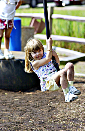
My results are below. I didn't get quite as much sharpness in the tire, and I lost some of the detail in the socks of the person behind the girl, but it's distracting background material that's better left somewhat fuzzy. I also like making the colors a little more saturated than the NASA version to enhance the sunny feel of the picture. However it took quite a bit of effort and creativity to find the right settings, while the Retinex enhancements were made on their default settings without any human intervention.
|
|
|
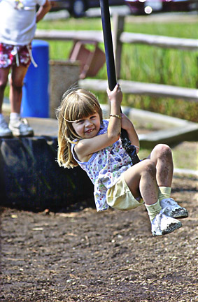
| Original image | With NASA technology | With Photoshop |
Technical details: I started with the high-resolution version of the image from NASA's site. First, I used Photoshop's Image->Adjust->Curves command. I adjusted only the overall RGB channel, with control points at 0:0, 10:30, 30:65, 140:175, 220:205, 240:225, and 255:255. This forms a steep curve in the dark range, to bring out the tire detail, a moderately steep curve in the lower midrange to preserve the girl's skin tones and the saturation of the grass behind her, a shallow curve in the upper midrange where not much of interest is happening, and a moderately steep curve again in the brights to preserve the detail there. It also causes some overall brightening of the image, which started out a little too dark. I used Image->Adjust->Hue/Saturation to add more saturation (20) to the colors. I then used Filter->Sharpen->Unsharp Mask, with a huge radius (250 pixels) and relatively high sharpening amount (50%) to bring up contrasts between large patches of color (especially between the tire and the girl's shirt), and did it again with radius 50 and amount 50% to enhance the medium sized objects. Next, I used Unsharp Mask again with radius 15 and amount 30%, to bring out some of the smaller shapes in the picture, such as the girl's arms, and finally I used more normal Unsharp Mask settings (radius 1 and amount 150%) to enhance the details, especially paying attention to her hair, face, and dirty shins. Overall, this is much more sharpening than I usually use, but it was necessary in order to get close to the NASA appearance.
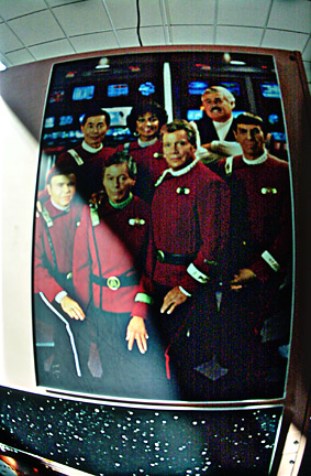
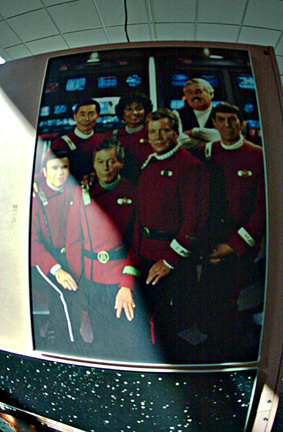
Roger N. Clark suggested that another of NASA's examples would be a difficult test: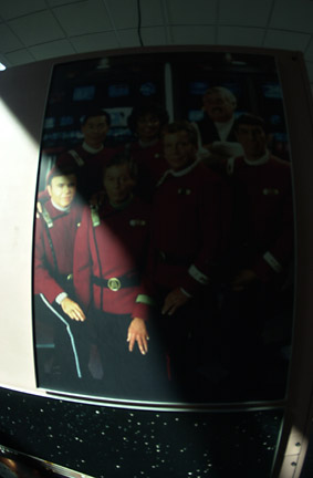 |
 |
 |
| Original image | With NASA technology | With Photoshop |
It's not identical, but I think I came very close -- the main differences I can see are that the NASA version has a slightly lighter ceiling, and there are some light-dark variations on the ceiling, shadows around the poster, and bottom star area that are somehow getting more evened out in my version. On the other hand I avoided the oversharpened grain on Kirk's shirt and wacky color in Scotty and Uhura's faces, and picked up a little more detail on the bright left edge.
The manipulations I performed, starting with the large original image, were: Image->Adjust->Curves with RGB control points at 0:0, 20:60, 50:110, 212:191, 237:215, and 255:255; Image->Adjust->Hue/Saturation, add +30 to saturation; four passes of Unsharp Mask with radii 100, 20, 4, and 0.5, and amounts 50%, 50%, 70%, and 300%; Gaussian Blur with radius 1.0; resize to 283x432.
The Blur is something I always do before resizing to avoid graininess, although usually that step is done in my web site creator rather than in Photoshop, and the Unsharp Mask sequence is something I've started doing with much less aggressive sharpening amounts after this retinex discussion. The curves are set up for a little overall lightening, plus enhancement of detail at the very bright and dark ends of the range -- this desaturates the middle range a little, so some additional saturation makes sense, but I think the Hue/Saturation adjustment is too high and would usually avoid it altogether for my own pictures.
D. Eppstein, ICS, UC Irvine, 23 Aug 2001, updated 1 Sep 2001