Guidelines for general screen layout
Overall appearance
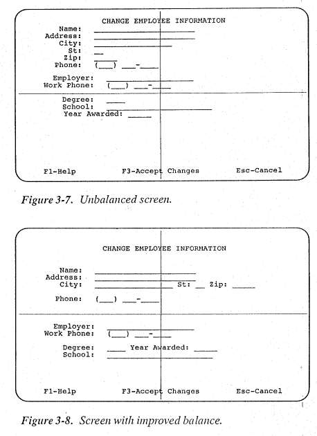
- The screen should contain a minimum
of 60% (and ideally 85%) whitespace.

-
The upper and the lower half of the screen
should roughly contain the same amount of whitespace.
- The
screen layout should be more or less vertically symmetric.
- Unnecessary
colors and embellishments should be avoided.
- Emphasis
should only be used if really necessary, and only with necessary prominence:
- low:
different font, underlining, upper case, spacing out
- medium:
different size, color or density, inverse video, framing
-
high:
blinking, acoustic signals
- Users focus attention at center and upper-leftish area of screen

 Place most important information in this area
Content
- All
information that is necessary to solve a coherent sub-task should be visible on
the same screen
(no flipping of pages, no copying/pasting of information)
- The screen
should not contain information that is never relevant for any user.
- Users
should always be able to find information on
- how
to get to the previous screen
- optional:
how to exit the subtask or the whole program
- how
to obtain help
Structure
- Create clear visual structure (hierarchy)

- It should reflect
the structure of the task or the task solution process, and not the structure
of the underlying program.
- Each subtask
should be grouped together in a clearly visually separated unit.
- Proximity/distance
is mostly good enough for grouping;
- if
not, use lines, differently colored backgrounds (similarity), or boxes.
-
If the same subtask is represented on more than one screen, it should be presented
at the same location on all screens.
Other
- Users should be able to enter and correct
data in arbitrary order.
- If
connecting screens have to be used,
- the
same headlines should be used
- information
units needed in two or more screens should be presented on all screens,
at the same location.
- Some sequence indicator should be used.
Special screen areas
Title line
- centered in
the upper part of the screen
- separated
by whitespace
- possibly
marked out by larger font, bold face, inverse
Lowermost screen part:
- Good place for status
information
- explanation
of available secondary menu options (help, exit, special function keys)
- dynamic
explanation of items that are touched by the mouse symbol (tooltips in the vicinity
of the items are more easily noticible though)
- warnings
and error messages (possibly with an acoustic signal that can optionally be turned
off)
Logos:
should go into the left or right upper corner
Clocks: should
not show seconds and should not tick
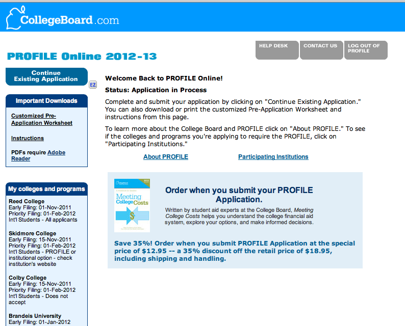
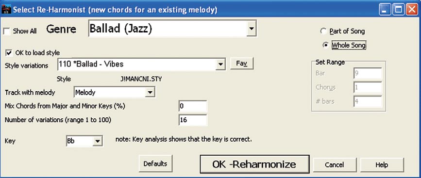
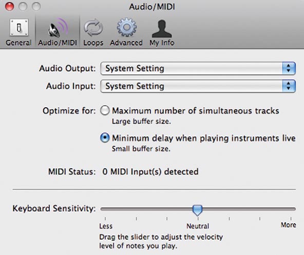
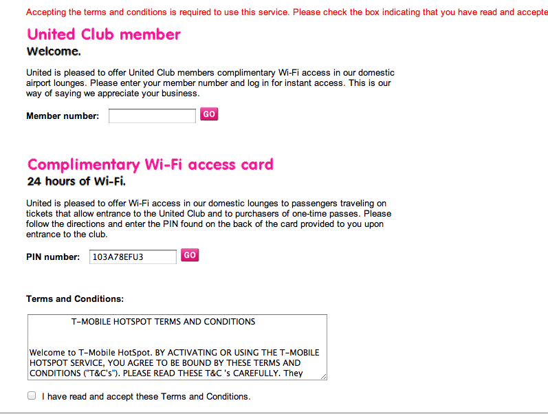
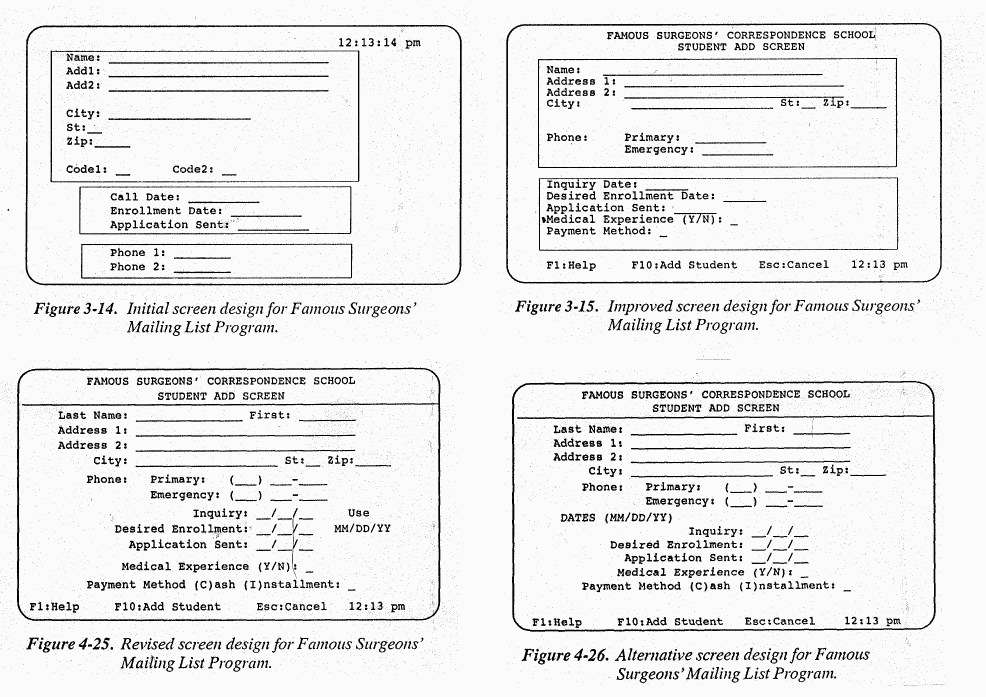
Example