
From:           bigelow@Sunburn.Stanford.EDU (Charles A. Bigelow)
Newsgroups:     comp.fonts,comp.graphics.algorithms
Subject:        Re: Kerning?
Date:           22 Jun 1994 00:26:24 GMT
Organization:   Computer Science Department,  Stanford University.
In article <1994Jun20.214444.9370@gallant.apple.com>,
Jens Alfke  <jens_alfke@powertalk.apple.com> wrote:
>The Exception, mlfallon@unix1.tcd.ie writes:
>> Does anyone have any details on how to kern, vector based characters.
>> I am looking for anything, theory, algorithm or code if possible.
>
>If you're asking about algorithms for automatically computing kerning values
>based on the geometric shape of the characters ... I'm not sure whether
>there's been any serious work done in this area.

Well, actually, there has been some serious work in this area, though the
problem is by no means solved, or, more accurately, there are several claims of
solutions, all different.

David Kindersley, a noted British stone carver and lettering artist, and Neil
Wiseman, computer scientist at Cambridge University, have collaborated for two
decades on algorithmic methods of letterspacing. Kindersley has written on this
research in a little booklet called *Optical Letterspacing for New Printing
Systems*, which appeared in the 1970's and has, I believe, come out in at least
one later edition. I believe also that he and Wiseman have published accounts
of it elsewhere, as well, but I don't have the references at hand. For a while,
and perhaps still, they were offering to license their algorithms to software
companies, but I do not know if any firms took them up on the deal. Too bad,
because they had some pretty interesting results. Their algorithms have changed
and evolved over the years, but at one time they were based on measuring the
moments of intertia of letters, as though they were cut-out spun about their
vertical axes.

URW has also done quite a lot of research on this problem, and their "Kernus"
software is the commercial result. I don't know what their latest algorithms
are, but at one time they were based on the model of electrostatic repulsion.

Other algorithms have been linear - equalizing distances between letters, which
doesn't give good results, unless you like the weird look that results, which
some people do, or areal - equalizing areas between letters, which works sort
of mediocrely, if you do some ad hoc fudging, especially in defining the
"meniscus" of internal vs. external space in a letter like 'c', or various
baroque schemes intended to remedy the obvious deficiencies in the linear and
areal approaches.

I personally am partial toward approaches that analyze letters as spatial
frequencies, for example by low-pass filtering the letters and adjusting
their spacing so as to achieve the cleanest spectrum for the lower frequencies
in the word image, but I don't know of anyone doing that commercially, and
besides, I barely understand what I mean by that myself!

-- Chuck Bigelow
From:           freek@phil.ruu.nl (Freek Wiedijk)
Newsgroups:     comp.fonts,comp.graphics.algorithms
Subject:        Re: Kerning?
Date:           22 Jun 1994 09:27:40 +0200
Organization:   Dept. of Philosophy, Utrecht University, The Netherlands
bigelow@Sunburn.Stanford.EDU (Charles A. Bigelow) writes:
>David Kindersley, a noted British stone carver and lettering artist, and Neil
>Wiseman, computer scientist at Cambridge University, have collaborated for two
>decades on algorithmic methods of letterspacing. Kindersley has written on this
>research in a little booklet called *Optical Letterspacing for New Printing
>Systems*, which appeared in the 1970's and has, I believe, come out in at least
>one later edition. I believe also that he and Wiseman have published accounts
>of it elsewhere, as well, but I don't have the references at hand. For a while,
>and perhaps still, they were offering to license their algorithms to software
>companies, but I do not know if any firms took them up on the deal.

From some time ago:
================================================================
>From hugo@harlqn.co.uk Fri Mar 13 19:23:22 1992
>From: Hugo Tyson <hugo@harlqn.co.uk>
>Date: Fri, 13 Mar 92 17:41:18 GMT
>Message-Id: <21315.9203131741@morris.harlqn.co.uk>
>To: freek@fwi.uva.nl
>Subject: OCS Patent
>Cc: hugo@harlqn.co.uk
>Status: RO

In article <1992Mar3.153923.14555@fwi.uva.nl> you write:
>Does there exist a publicly available implementation of David
>Kindersley's LOGOS system?  This system is a method for automatically
>generating kerning tables for a given font.

I think you should be aware that the method is patented, by David
Kindersley and Neil Wiseman, the patent was then held by a company
called Cambridge SuperVision, formed by the two plus an investor, who
have since signed over exclusive rights to the patent and associated
methods to us, Harlequin Limited.

We have, available now, a portable software library to perform OCS,
and other spacing processes required my modern typographers.  If you
have a serious interest in this, please do contact Harlequin again
for details.

BTW, yes, it is hard to implement in terms of getting the maths right
every time, and choosing the correct variables to control the
calculations.  Obviously I will say no more.

	- Huge

Any opinions herein are mine only.  Even the postcode may be wrong
   ---------------------  Hugo Tyson  -------------------------
Harlequin Limited, Barrington Hall, Barrington, Cambridge, CB2 5RG
England;    Tel.  (UK) 0223 872522  (International) +44 223 872522
   ------------------------------------------------------------
If God/Darwin had meant us to use single-button mice,
     He would have given us prehensile noses.
================================================================

Hope this helps :-)

Freek
--
Third theory of Phenomenal Dynamics:  The difference between
a symbol and an object is quantitative, not qualitative.
Newsgroups:     comp.fonts,comp.graphics.algorithms
From:           stijnr@sci.kun.nl (Stijn Raaijmakers)
Subject:        Re: Kerning?
Organization:   University of Nijmegen, The Netherlands
Date:           Wed, 22 Jun 1994 10:28:28 GMT
In <2u80fg$arh@Times.Stanford.EDU> bigelow@Sunburn.Stanford.EDU (Charles A. Bigelow) writes this about automatic kerning:

[...]

>I personally am partial toward approaches that analyze letters as spatial
>frequencies, for example by low-pass filtering the letters and adjusting
>their spacing so as to achieve the cleanest spectrum for the lower frequencies
>in the word image, but I don't know of anyone doing that commercially, and
>besides, I barely understand what I mean by that myself!

Wouldn't this result in the same kerning for an E with small filled
triangles as serifs and an E with very long, thin serifs (which would
need about the same kerning as an N).  And wouldn't the difference in
kerning be to big for VA and AV?  I spent some time thinking about
automatic kerning, as I thought it might be a good subject for my
thesis (computer science), but doesn't seem to be so appropriate.  Too
bad.

Sti(bad kerning here, usually)jn.
From:           mcintosh@donald.cc.utexas.edu (Aubrey McIntosh)
Newsgroups:     comp.fonts,comp.graphics.algorithms
Subject:        Re: Kerning?
Date:           22 Jun 1994 18:37:27 -0500
Organization:   Chemistry Department, University of Texas, Austin TX 78712
In comp.fonts & al.,
bigelow@Sunburn.Stanford.EDU (Charles A. Bigelow) writes:

> I personally am partial toward approaches that analyze letters as spatial
> frequencies, for example by low-pass filtering the letters and adjusting
> their spacing so as to achieve the cleanest spectrum for the lower frequencies
> in the word image, but I don't know of anyone doing that commercially, and
> besides, I barely understand what I mean by that myself!

Well, I know what it means, and I had an Aha! reaction to the idea.
There is a Scientific American article in about 1965 on recognition
of faces that, if I trust 20 year old memories (1), shows the
results of several digitized portraits of Washington and other well
known images that have been bandpassed at various frequencies.

They discuss a "critical bandpass region" where interference is
high,  and show that there can be large noise outside this region
that does not interfere very much with recognition.

Gosh, I can see myself spending *all* my hobby time budget adjusting
various metafont files to make the letters have similar frequency
signatures, including certain harmonics, and adjusting the kerning
so that the phase matching is good.

I can see the adjustment of stems and serifs to various spatial
frequency harmonics as a second topic, just in cast not enough
time is spent in the first study.

1) 1994-1965 = 29.  I read it more recently.

--
5/23/94  Sunny, highs near 90.  Seasonal tornadic conditions. Garden
is vigorous, many plants reaching eye level.  Beets nearing end of
harvest window, corn tassled.  Squash and tomatoes in production.
Blackberries :-)
From:           tiro@portal.ca (Tiro TypeWorks)
Date:           Sat, 30 Mar 1996 22:11:02 GMT
Newsgroups:     comp.fonts
Subject:        Re: Speaking of spacing (was Re: Walbaum-font)
quixote@primenet.com (Donald A. Hosek) wrote:

>Speaking of spacing, does anyone have a US patent number for
>Kindersley's LOGOS system? (Or any other country's patent number if
>necessary). I'm curious to know exactly how the center spacing points
>are determined for the letters & attempting a home-brew LOGOS-spacer
>(the legal limits of its use are yet another question... certainly
>there is the catch that if I roll my own, no one else can have a copy,
>but the use of its output is another question entirely).

I'm afraid I can't help you with the patent numbers, but my
understanding of the centre spacing points are as follows. Note that
Logos depends to a great degree on the letters themselves being
'correctly formed' -- ie. Kindersley's notion of correct spacing is
inextricably linked to this ideas of correct letterforms. It is a
system based on visual balance, which means that all the letters must
carefully balanced with each other. You mention the problems of
correctly spacing the Bembo uppercase R; Kindersley may well  have
simply rejected the form.

For the spacing of uppercase letters under Logos, R is actually the
key letter. According to Kindersley (quoted in Rosemary Sassoon's
excellent 'The Practical Guide to Lettering and Applied Calligraphy'),
'The relation of space to letter should remain constant, in such a way
that the optical vertical centre of any letter is also the
mathematical vertical centre of the space which with letter occupies.
Thus the R, which in most alphabets is the most off-centre
mathematically, becomes the key to the spacing throughout the
alphabet.'

I can upload a diagram, if people would find it useful, but the
treatment of the R is basically as follows. The optical vertical
centre of the R must be determined by eye. (Kindersley did a great
deal of work in optics, to devise an electronic equivalent for this,
but never seems to have matched his own ability to see the centre.)
Once the optical vertical centre of the letter has been identified, a
line, A, is drawn through it. A horizontal measurement is taken from
the base of line A to the base of line B, which is drawn vertically at
the tip of the R's leg. This distance, A-B, is then measured to the
left, from A, to produce A-C, where C is becomes the left sidebearing
of the character. From this, the sidebearings of all verticals can be
determined.

This is the basis of Logos, and from it one can deduce both the
strengths and the weaknesses of the system. The system does not, for
example, take into account the optical effect of the thin vertical
stems found in most uppercase Ns, which require narrower spacing than
the thicker stems of most other letters. On the positive side, the
system guarantees certain typographical niceties, such as optically
justified margins.

As Kindersley admitted, concluding his anaylsis of the uppercase R,
'This is the underlying principle of mys standard spacing, but there
are many modifications that have to be made in order to produce a
really even fit.'

John Hudson, Type Director

Tiro TypeWorks
Vancouver, BC
tiro@portal.ca
http://www.portal.ca/~tiro
Newsgroups:     comp.fonts
From:           lee@sq.com (Liam R. E. Quin)
Subject:        Re: f-ligature frustrations
Organization:   SoftQuad Inc., Toronto, Canada
Date:           Tue, 14 May 1996 23:52:30 GMT
Alan Sargent <sargent@Gateway.net.hk> wrote:
> Obviously it would be impractical to predefine kerning for mixed fonts --
> billions ( (100 chars * 1000 fonts)exp2  at least) of pairs -- but if the
> widths and offsets are done consistently you shouldn't get collisions.

The only way I know of to do this is with sectored kerning, e.g. as used
by the Compugraphic MCS series typesetters years ago...
The idea of sectored kerning is that you have a low resolution surrogate.
For example, with 4 sectors, you might represent boy as

    #
    ### ### ###
    ### ###  ##
	     ##

Now, you can fit Toy like this:

    #####
      #
      # ### ###
      # ###  ##
	     ##

This usually needs to be augmented by kern pairs for the exceptions, and
it turns out to be tricky to define the sector heights, and also to
determine the values, since changing a single value -- e.g. the width
of the top of `T' -- affects every letter combination next to a T.

In practice, systems using this normally used four vertical sectors, and
allowed widths from 0 to 256 both on each side of the character, measured
outwards.

I'm not aware of any modern systems working this way.

In principle, you could kern across fonts as long as the x-height,
descender-height and cap-height were the same, and get plausible, if not
always excellent, results.   In practice, I don't recall any systems that
did this, except possibly the Compugraphic MCS series (I've forgotten).

Lee

--
Liam Quin, SoftQuad Inc    | lq-text freely available Unix text retrieval
lee@sq.com +1 416 239 4801 | FAQs: Metafont fonts, OPEN LOOK UI, OpenWindows...
SGML: http://www.sq.com/   |`Consider yourself... one of the family...
The barefoot programmer    | consider yourself... At Home!' [the Artful Dodger]
The following messages are based around two example images posted by Tiro Typeworks, of a kerning system based on defining certain rectangular polygons that approximate the shapes of the original letters, and packing these shapes as closely as possible:
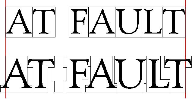
From:           Lorp@truetype.demon.co.uk (Laurence Penney)
Newsgroups:     comp.fonts
Subject:        Re: Kern-font demo (Was: Laurence Penney's...} - kernfont.gif (0/1)
Date:           Sun, 19 May 1996 23:45:44 GMT
Organization:   Kendrick Digital Typography
tiro@portal.ca (Tiro TypeWorks) wrote:

>Attached is a small binary file showing a quickly knocked up demo of
>what Laurence seems to be proposing.

That's exactly right!

>                                     Having done this experiment, I
>remain intrigued by the possibility. As a spacing model, the kern-font
>idea is certainly possible. I suspect it would be very time-consuming
>to make sure that a character's kern-outline connected properly with
>every other character's, but I see no theoretical reason why it
>shouldn't work. I had chosen the words AT FAULT ahead of time (as it
>contains a variety of kerning problems), and this largely guided the
>shaping of my kern-outlines, although I tried to anticipate what their
>final shapes might be if they were to be properly fitted with a
>complete alphabet.

I imagined the kern-glyphs being less blocky, using curves more closely
related to the image-glyph than your kern-bands. Perhaps, like the extent
of a "field" created by the "mass" of the black of the letter, heavy parts
of the letter would be relatively far from the kern-edge, while the
kern-edge would come very close to thin parts. This would be achievable
algorithmically, with maybe only a little fine-tuning needed.

>...
>As demonstrated in the sample, the even space character can be given
>an appropriate kern-outline to kern with the extreme overhang of
>letters such as T, V, etc.

I think this probably isn't ideal. What about characters that bulge in the
middle? White space should not be treated as if it were a glyph - which it
is only in a narrow, technical, font-format sense. Rather, a system should
ensure that the horizontal minimum distance (HMD) between two kern-glyphs
either side of a space is "space-width", rather than zero (the system's
HMD value for unspaced kern-glyphs).

>An added bonus, as demonstrated by the red lines, is the adaptability
>of the system to optically justifying margins.

From your picture, it's not clear how the system would determine the
"optically justifying margins" (no character has a "standard" advance
width any more). A mean or median average of the kern-edge would be one
idea.

Glad you like the proposal,

-- Laurence Penney
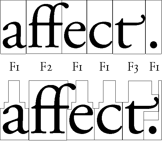
From:           tiro@portal.ca (Tiro TypeWorks)
Newsgroups:     comp.fonts
Subject:        Kern-font demo 2 (Was: Laurence Penney's...) - kernfon2.gif (0/1)
Date:           Sun, 19 May 1996 00:50:52 GMT
Organization:   Tiro TypeWorks
This is my second experiment with Laurence Penney's kern-font
proposal. In this sample, I have combined three fonts from the Adobe
Garamond family: Regular (F1), Expert (F2) and Alternate (F3). This
demonstrates the cross-font kerning potential of Laurence's proposal.

In the first line, the characters are combined without any kerning
applied. This is how they would appear after ligature and alternate
substitutions in any word-processor or page-layout program.

In the second line, the kern-font spacing has been applied. Using this
system, I was able to create a better fit between the 'ff' ligature
and the following 'e', and nicely tucked the punctuation under the arm
of the terminal 't'.

John Hudson, Type Director

Tiro TypeWorks
Vancouver, BC
tiro@portal.ca
http://www.portal.ca/~tiro
Newsgroups:     comp.fonts
From:           lee@sq.com (Liam R. E. Quin)
Subject:        Re: Kern-font demo (Was: Laurence Penney's...} - kernfont.gif (0/1)
Organization:   SoftQuad Inc., Toronto, Canada
Date:           Sat, 18 May 1996 19:55:57 GMT
John, your gif is essentially using sectored kerning.

Draw another red vertical line through the centre of each chracter.
(it doesn't have to be the exact centre, middlish is OK).

You've used approx. 8 different vertical positions for your boxes.
Let's say for now that there are eight sectors with fixed positions.
(this may not work as well, bt bear with me, I pray you)

From the centre-line, measure the distance first to the right and then to
the left of your rectangularised letter, in the middle of each of these
eight sectors.

This will give you eight pairs of numbers.  These represent the sector kerns
for that character.

The fitting algorithm is very straight-forward given such sectors.
You add the widths of sectors a pair at a time and take the largest as the
distance between vertical centres.

Most commercial sectored-kern systems I have seen only support 4 or 6 sectors,
which I always felt was too small a number.  It would be interesting to
try modifying our text engine (part of sqtroff) to handle larger numbers
of sectors, and then see what could be produced atomatically.

If you have fewer sectors, the fixed heights become more of a problem.
For example, with only 4 sectors, you can't really kern A and U together
as well as you've done it.  With six you can, although you need to save at
least one sector for lower case descenders.

All the fonts I have today use kern pairs, and sqtroff isn't available on
the Mac (Unix only), or I'd send you a demo.

With 196 glyphs in a font, and allowing at most 256 values for the width
on each side of centre (approx 512 ppem), 10 sectors would give us
196 * 10 * 2 bytes, or 3,920 bytes of kern information, stored in binary
format.

With only 16 values on each side, that could be halved to 1,960 bytes.

There is a variation that uses not the centre of the character, but the
left and right edges (respectively) of the bounding box.  In this case,
the numbers are smaller, and one can allow 256 values at 1000 ppem, but
in practice the numbers will usually be smaller.  This is the method used
in sqtroff, as I recall (it's been maybe 7 or 8 years since I looked at
using sectored kerning with sqtroff!).

Since kern pairs each have to have at least one character name (you can
deduce the other if you store the kerns along with, say, the left-hand
character), using sectors starts to save space after maybe a couple of
hundred kern pairs.  In theory, the sectors could be derived automatically,
which would certainly be a help.  And of course, if the heights of the
sectors are recorded (sqtroff didn't do this), you could kern across fonts,
with at least moderate success I should think.

Lee

--
Liam Quin, SoftQuad Inc    | lq-text freely available Unix text retrieval
lee@sq.com +1 416 239 4801 | FAQs: Metafont fonts, OPEN LOOK UI, OpenWindows...
SGML: http://www.sq.com/   |`Consider yourself... one of the family...
The barefoot programmer    | consider yourself... At Home!' [the Artful Dodger]
From:           David Marshall <D.P.Marshall@durham.ac.uk>
Newsgroups:     comp.fonts
Subject:        Re: Kern-font demo (Was: Laurence Penney's...} - kernfont.gif (1/1)
Date:           Sat, 18 May 1996 19:22:55 +0100
Organization:   University of Durham, Durham, UK
I like this. I like it a lot. It does remind me of Intellifont's sectored
kerning which could use an aribtrary number of sectors (although Agfa
always used four) for which the position of the sectors was never known to
the rasterizer (it was just numbers). Some fonts split the cap height up
evenly into four sectors, some split the x-height into three even sectors
and one for the rest, some split it up strangely.

Because there was no standard definition for where the sectors actually
were, it wasn't possible to use kerning across fonts. A shame.

Dave
--
       "The tangled web of worries around speech shows how little
            people know about it" - Professor Jean Aitchison

mailto:D.P.Marshall@durham.ac.uk           http://www.dur.ac.uk/~d3r6yw/
From:           tiro@portal.ca (Tiro TypeWorks)
Newsgroups:     comp.fonts
Subject:        Re: Kern-font demo (Was: Laurence Penney's...} - kernfont.gif (0/1)
Date:           Sun, 19 May 1996 00:42:31 GMT
Organization:   Tiro TypeWorks
lee@sq.com (Liam R. E. Quin) wrote:

>John, your gif is essentially using sectored kerning.

I understand the similarity to vectored kerning, but there are some
important differences in Laurence's proposal that I find interesting,
most importantly in the proposed application. There are two related
problems with vectored kerning, both of which you bring up in your
post. The first involves the number of sectors employed, and the
second, derived from the first, involves the quantity of kern data to
be included in the vector kerned font.

From a typographic point of view, it is the first problem that
concerns me most. Correct letterspacing is something of an exact
science. As you correctly point out, 4-6 sectors is hardly sufficient
to ensure correct spacing. In fact, such a system puts us right back
to the fitting problems of the Linotype machine: we would end up
having to adjust letterforms to fit the spacing system. What number of
sectors is sufficient? How much kerning data would result from such a
quantity? And how and where in the font would this data be stored?

What intrigues me about Laurence's proposal is a) the tailoring of the
kern-outline to each individual character form, and b) the storing of
such data in an invisible, background font from which the visible font
receives its spacing metrics.

>And of course, if the heights of the sectors are recorded
>(sqtroff didn't do this), you could kern across fonts,
>with at least moderate success I should think.

In my second experiment, I have applied Laurence's
principle to three fonts from the Adobe Garamond family, to show how
well the system works for cross-font kerning.

Now I think about it, the term 'kerning' actually becomes irrelevant
in the application of this system. Under Laurence's proposal there is
simply 'spacing', which, as any calligrapher or stonecutter will tell
you, is a function of the form of the letters, rather than of the
system employed to render them. This distinction is, perhaps, what
most appeals to me about the 'kern-font' proposal.

John Hudson, Type Director

Tiro TypeWorks
Vancouver, BC
tiro@portal.ca
http://www.portal.ca/~tiro
From:           typenerd@slip.net (David Lemon)
Newsgroups:     comp.fonts
Subject:        Re: Kern-font demo (Was: Laurence Penney's...} - kernfont.gif (0/1)
Date:           Sun, 19 May 1996 08:43:57 -0800
Organization:   Juicy Graphics
In article <4nlqf2$mk8@thoth.portal.ca>, tiro@portal.ca (Tiro TypeWorks) wrote:
> I understand the similarity to vectored kerning, but there are some
> important differences in Laurence's proposal that I find interesting,
> most importantly in the proposed application.

While it's clear that either a designer-specified kern edge or good sector
kerning would
- give good results for cross-font spacing
- do much better than kern pairs for unanticipated glyph combinations
within a single font, and
- probably do nearly as well as manually-spec'd kern pairs in anticipated
combinations,

one obvious drawback is that either approach would require a data format
that current applicaions and renderers are not prepared for. The other
obvious drawback is that no current fonts use either, so font collections
would have to be repurchased.

- David Lemon
  type nerd
  Back in June we delivered oxygen equipment of the same size.
From:           David Marshall <D.P.Marshall@durham.ac.uk>
Newsgroups:     comp.fonts
Subject:        Re: Kern-font demo (Was: Laurence Penney's...} - kernfont.gif (0/1)
Date:           Sun, 19 May 1996 00:59:18 +0100
Organization:   University of Durham, Durham, UK
Liam R. E. Quin wrote:
> Most commercial sectored-kern systems I have seen only support 4 or 6 sectors,
> which I always felt was too small a number.  It would be interesting to
> try modifying our text engine (part of sqtroff) to handle larger numbers
> of sectors, and then see what could be produced atomatically.
> If you have fewer sectors, the fixed heights become more of a problem.
> For example, with only 4 sectors, you can't really kern A and U together
> as well as you've done it.  With six you can, although you need to save at
> least one sector for lower case descenders.

The 4 in Intellifont was a little low - I guess they were balancing quality
with storage space. They did have the advantage that the positioning of the
sectors was arbitrary - they could be completely different for every font -
and so could be tuned to the font, but this makes inter-font kerning
impossible. Agfa gave no kerning space to descenders.

> With 196 glyphs in a font, and allowing at most 256 values for the width
> on each side of centre (approx 512 ppem), 10 sectors would give us
> 196 * 10 * 2 bytes, or 3,920 bytes of kern information, stored in binary
> format.
> With only 16 values on each side, that could be halved to 1,960 bytes.

It's a very compact method. Intellifont adjusts relative to the left and
right edges widths in 54ths of an em. Didn't URW use a method of categorizing
the left and right sides of characters and providing sector-based kerning for
each category?

> Since kern pairs each have to have at least one character name (you can
> deduce the other if you store the kerns along with, say, the left-hand
> character), using sectors starts to save space after maybe a couple of
> hundred kern pairs.  In theory, the sectors could be derived automatically,
> which would certainly be a help.  And of course, if the heights of the
> sectors are recorded (sqtroff didn't do this), you could kern across fonts,
> with at least moderate success I should think.

Sector-based kerning is such a good idea I really have no idea why it isn't
used in the more commercial formats (the Amiga's main format is still
Intellifont - or is that Intelephant?) I would like to see sector-based
kerning become more common - with either standard positions for sectors or
recording of sector positions. Inter-font kerning is highly desirable.

Who wants to persuade Microsoft to kludge sector-based kerning into their
TrueType engine? :)

Dave
--
       "The tangled web of worries around speech shows how little
            people know about it" - Professor Jean Aitchison

mailto:D.P.Marshall@durham.ac.uk           http://www.dur.ac.uk/~d3r6yw/
From:           tiro@portal.ca (Tiro TypeWorks)
Newsgroups:     comp.fonts
Subject:        Re: Kern-font demo (Was: Laurence Penney's...} - kernfont.gif (0/1)
Date:           Sun, 19 May 1996 03:00:58 GMT
Organization:   Tiro TypeWorks
lee@sq.com (Liam R. E. Quin) wrote:

>Since kern pairs each have to have at least one character name (you can
>deduce the other if you store the kerns along with, say, the left-hand
>character), using sectors starts to save space after maybe a couple of
>hundred kern pairs.

The beauty of Laurence's system is that it removes the need for kern
pairs, as such. Rather than having to second guess what letter
combinations are liable to crop up in an average user's texts, a type
designer would simply tailor the kern-outlines to his letterforms and
let these shapes determine all spacing. This means that every letter
would space itself optically with whatever was put beside it.

The phrase 'KsfsVQ yoTAv' is nonsense, but under the kern-font system
it would be perfectly spaced nonsense -- even the grammatically
impossible combinations such as  'sV' and 'oT'. Each letter would fit
its kern outline as neatly as possible to the adjacent letter's kern
outline.

This also means that designers like myself, who are keen to correctly
space their fonts for multilingual typesetting, will no longer have to
play at amateur linguistics trying to determine what kern pairs might
be necessary in typesetting Lower Sorbic.

The more I think about Laurence's proposal, the more I like it. If
someone wants to develop this as a font format, they'd better give
Laurence a big wad of cash for the idea.

As yet, I can't figure out if there's a way to build letterspacing
(i.e. increasing space in strings of uppercase text) into the
kern-font system. I suspect this might not be possible. Mind you, most
Type 1 and TT manufacturers don't take advantage of this possibility
in existing formats, so probably wouldn't notice the loss. It would
remain possible, of course, to letterspace within layout applications.

John Hudson, Type Director

Tiro TypeWorks
Vancouver, BC
tiro@portal.ca
http://www.portal.ca/~tiro
From:           David Marshall <D.P.Marshall@durham.ac.uk>
Newsgroups:     comp.fonts
Subject:        Re: Kern-font demo (Was: Laurence Penney's...} - kernfont.gif (0/1)
Date:           Sun, 19 May 1996 02:49:53 +0100
Organization:   University of Durham, Durham, UK
Tiro TypeWorks wrote:
> b) the storing of
> such data in an invisible, background font from which the visible font
> receives its spacing metrics.

A nice idea, but technically more difficult to implement that sector-based
kerning. Even if you massively increase the number of sectors, sector-
based kerning will still be much faster than an invisible type body.

Dave
--
       "The tangled web of worries around speech shows how little
            people know about it" - Professor Jean Aitchison

mailto:D.P.Marshall@durham.ac.uk           http://www.dur.ac.uk/~d3r6yw/
From:           Christopher Fynn <cfynn@sahaja.demon.co.uk>
Newsgroups:     comp.fonts
Subject:        Re: Kern-font demo (Was: Laurence Penney's...} - kernfont.gif (0/1)
Date:           Sun, 19 May 96 11:41:28 GMT
Organization:   <None>
Reply-To:       cfynn@sahaja.demon.co.uk
In article <4nm2ik$sj6@thoth.portal.ca> tiro@portal.ca "Tiro TypeWorks" writes:

...
> The phrase 'KsfsVQ yoTAv' is nonsense, but under the kern-font system
> it would be perfectly spaced nonsense -- even the grammatically
> impossible combinations such as  'sV' and 'oT'. Each letter would fit
> its kern outline as neatly as possible to the adjacent letter's kern
> outline.

As an aside to the main issue here.

With some systems for transcribing certain scripts into
the roman alphabet such  mixed case "nonsense" can occur.
For instance Tibetan has some letters and vowels which are
sometimes reversed. In roman transcription when these occur
they are usually indicated by a change of case.

Other people use an upper case letter to indicate the main
letter in a syllable  - as Tibetan has silent prefixes this
this looks like:  bsGrub brGyud

There are also some strange combinations used in Pinyin the
system of writing Chinese in Roman script widely used in China.
- Don't assume that you only need to make kerning pairs
for combinations that occur in European languages.

Another kerning feature I'd like to see is the ability to kern more
than a pair of letters. Some scripts have subjoined letters
something like this:

               ACDEGH
               B  F

In this case A may need to kern with both B and C and E with F
and G.

- Chris

--
Christopher J Fynn                   <cfynn@sahaja.demon.co.uk>
=-=-=-=-=-=-=-=-=-=-=-=-=-=-=-=-=-=-=-=-=-=-=-=-=-=-=-=-=-=-=-=
4 Chester Court
84 Salusbury Rd
London NW6 6PA
United Kingdom                        Tel: +44 (0) 171 625 8925
From:           orandier@planete.net (Olivier RANDIER)
Newsgroups:     comp.fonts
Subject:        Re: Kern-font demo (Was: Laurence Penney's...} - kernfont.gif (0/1)
Date:           20 May 1996 22:43:28 GMT
Organization:   planete
In article <319E6456.2F3E@walton.dur.ac.uk>, David Marshall
<D.P.Marshall@durham.ac.uk> wrote:

> Liam R. E. Quin wrote:
> > With 196 glyphs in a font, and allowing at most 256 values for the width
> > on each side of centre (approx 512 ppem), 10 sectors would give us
> > 196 * 10 * 2 bytes, or 3,920 bytes of kern information, stored in binary
> > format.
> > With only 16 values on each side, that could be halved to 1,960 bytes.
>
> It's a very compact method. Intellifont adjusts relative to the left and
> right edges widths in 54ths of an em. Didn't URW use a method of categorizing
> the left and right sides of characters and providing sector-based kerning for
> each category?

I missed the beginning of the thread, but I think I've got a good
understanding of what you mean. So I thought you all would be interesting
in knowing that something like that already exists!
I have been using FontStudio for years (Did I tell you that I love this
program?... Yes, I did ;-)), and it has a special feature for
automatically creating kerning pairs and measures. In FontStudio, you have
two layers, front for creating glyphs, back for anything you want (very
useful to use vector models). You can trace in the background the
"kern-font" you speak about, and then ask FontStudio to generate kerning
pairs and measures using it. You specify the relative and/or absolute
distance between "kern-font" glyphs and just run it. It's well explained
in the doc. I thought that features was present in FOG, as autokern
fonction was mentionned in the adds. But, as you all doesn't seem to know
about it, I suppose that autokern in FOG doesn't work that way. That's
another reason for me not to get to FOG instead of FontStudio!
So I think you should get in touch with the developpers of FontStudio to
have information about their autokern engine (especially if you want to
include it in a font format (not in True Type, please, you all know
professionals dont want to deal with True Type -- maybe in OpenType?).
Give them a shake-hands for me!

--
Olivier Randier -- Experluette
From:           Lorp@truetype.demon.co.uk (Laurence Penney)
Date:           Tue, 21 May 1996 01:10:07 GMT
Newsgroups:     comp.fonts
Subject:        Re: Kern-font demo (Was: Laurence Penney's...} - kernfont.gif (0/1)
David Marshall <D.P.Marshall@durham.ac.uk> wrote:

>Tiro TypeWorks wrote:
>> b) the storing of
>> such data in an invisible, background font from which the visible font
>> receives its spacing metrics.

>A nice idea, but technically more difficult to implement that sector-based
>kerning. Even if you massively increase the number of sectors, sector-
>based kerning will still be much faster than an invisible type body.

The algorithms to touch bezier-edges are clearly more complex than normal
kerning or sector kerning, but rather less complex than rasterizing a
typical glyph. In any case, you could implement a kerning-cache!

Common combinations would get stored, on disk and in memory, after
preparing only a few documents - automatically adjusting to your language
and habits. You could store your "overrides" there too. Pre-computed
kerning tables could still be supplied with fonts, much like TrueType's
'hdmx' table (without which fonts are slowed down but otherwise
unaffected). Without cacheing (for bitmaps) and pre-computation (e.g. for
bounding boxes), scalable fonts would still be deathly slow...

-- Laurence Penney
From:           rhancock@tdc.dircon.co.uk (Ralph Hancock)
Newsgroups:     comp.fonts
Subject:        Re: Kern-font demo (Was: Laurence Penney's...} - kernfont.gif (0/1)
Date:           22 May 1996 02:45:08 +0100
Organization:   The Direct Connection
orandier@planete.net (Olivier RANDIER) writes:
> In article <319E6456.2F3E@walton.dur.ac.uk>, David Marshall
> <D.P.Marshall@durham.ac.uk> wrote:

...
> I have been using FontStudio for years (Did I tell you that I love this
> program?... Yes, I did ;-)), and it has a special feature for
> automatically creating kerning pairs and measures. In FontStudio, you have
> two layers, front for creating glyphs, back for anything you want (very
> useful to use vector models). You can trace in the background the
> "kern-font" you speak about, and then ask FontStudio to generate kerning
> pairs and measures using it. You specify the relative and/or absolute
> distance between "kern-font" glyphs and just run it. It's well explained
> in the doc. I thought that features was present in FOG, as autokern
> fonction was mentionned in the adds. But, as you all doesn't seem to know
> about it, I suppose that autokern in FOG doesn't work that way. That's
> another reason for me not to get to FOG instead of FontStudio!
> So I think you should get in touch with the developpers of FontStudio to
> have information about their autokern engine (especially if you want to
> include it in a font format (not in True Type, please, you all know
> professionals dont want to deal with True Type -- maybe in OpenType?).
> Give them a shake-hands for me!
>
Type Designer has an autokern feature that divides the space between
letters into up to 64 horizontal stripes and kerns them so that the
shortest stripe between two glyphs is always the same length. This gives
a reasonable rough kerning, though you need to adjust things like AH, which
would need to be closer serif-to-serif than HH but would be put the same
distance apart. The kerning is recorded in a perfectly conventional way,
of course. You can specify categories that are to be kerned with each other
or treated similarly - without which you would have a ridiculous number of
kerning pairs.

Ralph Hancock <rhancock@dircon.co.uk>
Part of
Geometry in Action,
a collection of applications of computational geometry.
David Eppstein,
Theory Group,
ICS,
UC Irvine.
Last update: .